ShopDreamUp AI ArtDreamUp
Deviation Actions


Suggested Deviants


Suggested Collections


![#Especial de Fonts 1/5 [Electro Fonts]](https://images-wixmp-ed30a86b8c4ca887773594c2.wixmp.com/i/376313a1-3b6d-47a1-99a5-a28735095000/d6pr7xq-418092da-91bd-4458-bd71-0cb44f4a2ef2.jpg/v1/crop/w_184,h_184,x_0,y_23,scl_0.368,q_70,strp/_especial_de_fonts_1_5___electro_fonts__by_franceeditions_d6pr7xq-92s-2x.jpg)
![#Especial de Fonts 1/5 [Electro Fonts]](https://images-wixmp-ed30a86b8c4ca887773594c2.wixmp.com/i/376313a1-3b6d-47a1-99a5-a28735095000/d6pr7xq-418092da-91bd-4458-bd71-0cb44f4a2ef2.jpg/v1/crop/w_92,h_92,x_0,y_12,scl_0.184,q_70,strp/_especial_de_fonts_1_5___electro_fonts__by_franceeditions_d6pr7xq-92s.jpg)
![New Fonts [ #1 PACK ]](https://images-wixmp-ed30a86b8c4ca887773594c2.wixmp.com/i/8e00ab86-f6c1-4159-a302-d96fcf36e489/d8i5oui-f9ace2e0-da61-47b0-936d-cb321479659c.png/v1/crop/w_184,h_184,x_0,y_2,scl_0.368/new_fonts____1_pack___by_tropicsong_d8i5oui-92s-2x.png)
![New Fonts [ #1 PACK ]](https://images-wixmp-ed30a86b8c4ca887773594c2.wixmp.com/i/8e00ab86-f6c1-4159-a302-d96fcf36e489/d8i5oui-f9ace2e0-da61-47b0-936d-cb321479659c.png/v1/crop/w_92,h_92,x_0,y_1,scl_0.184/new_fonts____1_pack___by_tropicsong_d8i5oui-92s.png)
![[+Font]Avril Lavigne Self-Tittled Album.](https://images-wixmp-ed30a86b8c4ca887773594c2.wixmp.com/f/03a42638-b8aa-4266-8fa8-0c265902c64c/d70shjc-2b42dd9b-1c0d-4075-8c33-6ec3172438f9.jpg/v1/crop/w_184,h_184,x_30,y_0,scl_0.43705463182898,q_70,strp/__font_avril_lavigne_self_tittled_album__by_neverstopbelieve_d70shjc-92s-2x.jpg?token=eyJ0eXAiOiJKV1QiLCJhbGciOiJIUzI1NiJ9.eyJzdWIiOiJ1cm46YXBwOjdlMGQxODg5ODIyNjQzNzNhNWYwZDQxNWVhMGQyNmUwIiwiaXNzIjoidXJuOmFwcDo3ZTBkMTg4OTgyMjY0MzczYTVmMGQ0MTVlYTBkMjZlMCIsIm9iaiI6W1t7ImhlaWdodCI6Ijw9NDIxIiwicGF0aCI6IlwvZlwvMDNhNDI2MzgtYjhhYS00MjY2LThmYTgtMGMyNjU5MDJjNjRjXC9kNzBzaGpjLTJiNDJkZDliLTFjMGQtNDA3NS04YzMzLTZlYzMxNzI0MzhmOS5qcGciLCJ3aWR0aCI6Ijw9NzAwIn1dXSwiYXVkIjpbInVybjpzZXJ2aWNlOmltYWdlLm9wZXJhdGlvbnMiXX0.YcBhppm1cUTQx44fK-PypgK0EVocR4jkRV86hlUFtX4)
![[+Font]Avril Lavigne Self-Tittled Album.](https://images-wixmp-ed30a86b8c4ca887773594c2.wixmp.com/f/03a42638-b8aa-4266-8fa8-0c265902c64c/d70shjc-2b42dd9b-1c0d-4075-8c33-6ec3172438f9.jpg/v1/crop/w_92,h_92,x_15,y_0,scl_0.21852731591449,q_70,strp/__font_avril_lavigne_self_tittled_album__by_neverstopbelieve_d70shjc-92s.jpg?token=eyJ0eXAiOiJKV1QiLCJhbGciOiJIUzI1NiJ9.eyJzdWIiOiJ1cm46YXBwOjdlMGQxODg5ODIyNjQzNzNhNWYwZDQxNWVhMGQyNmUwIiwiaXNzIjoidXJuOmFwcDo3ZTBkMTg4OTgyMjY0MzczYTVmMGQ0MTVlYTBkMjZlMCIsIm9iaiI6W1t7ImhlaWdodCI6Ijw9NDIxIiwicGF0aCI6IlwvZlwvMDNhNDI2MzgtYjhhYS00MjY2LThmYTgtMGMyNjU5MDJjNjRjXC9kNzBzaGpjLTJiNDJkZDliLTFjMGQtNDA3NS04YzMzLTZlYzMxNzI0MzhmOS5qcGciLCJ3aWR0aCI6Ijw9NzAwIn1dXSwiYXVkIjpbInVybjpzZXJ2aWNlOmltYWdlLm9wZXJhdGlvbnMiXX0.YcBhppm1cUTQx44fK-PypgK0EVocR4jkRV86hlUFtX4)


You Might Like…


Featured in Groups


Description
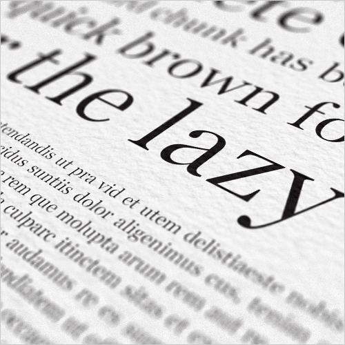
With books and magazines in mind, SD Tranz Light has been tweaked and slimmed specially for high-density web and offset printing. SD Tranz accentuates influences from Clarendon-style typefaces which is most prevalent when looking at it’s matching italic partner and old-style figures.
************************************************************************
DOWNLOAD THE FULL SET HERE
Support for English, Spanish, Portuguese, German, Danish, Swedish and more...
************************************************************************
************************************************************************
DOWNLOAD THE FULL SET HERE
Support for English, Spanish, Portuguese, German, Danish, Swedish and more...
************************************************************************
© 2011 - 2024 SynergyDigital
Comments15
Join the community to add your comment. Already a deviant? Log In
Hi. How can I get in touch?